design Sprint
Microsoft Copilot redesign:
A team project applying Google Design Sprint to improve information scent
Overview
This project was completed as a three-person team (Liz, Rachel and Gini) design sprint for Fundamentals of Human-Centered Computing class. Our team evaluated Microsoft Copilot, identified usability issues, generated redesign ideas, built a prototype, and tested whether users could complete a shopping-related task more efficiently.
I participated in the full sprint process, including problem analysis, ideation, group discussion, prototype iteration, and user testing. In the Figma design phase, my main contribution focused on the Shopping Page sketches and redesign.
To structure the project, we followed five sprint phases: unpack, sketch, decide, prototype, and test. This helped us move from broad usability problems to a focused redesign direction for Copilot’s landing page, sidebar, and shopping flow.
Unpack
We explored Microsoft Copilot as a group, including the experience before and after signing in, the side navigation, settings, content creation, saved content, and connected-system features such as calendar or email access. Our target audience was a busy student who wants help gathering and synthesizing information, while still being able to explore results independently.
Evidence of Isseus
We identified several issues in the original Copilot interface. The side navigation included vague categories such as Discover, Shopping, Imagine, and Labs, but these labels did not clearly explain what users could expect from each section. This created weak information scent and made the interface harder to navigate.
We also found issues with memorability and task continuity. Once users created or saved a project, its location could become hidden when the sidebar section was collapsed. The sign-in button was also placed far from reminders about signed-in features, which made account-related actions less visible and harder to acquire.

Sketch
Each team member created redesign sketches based on the issues we found. The sketches explored problems such as weak Information Scent, Visibility, Fitts’ Law, Gulf of Execution, Gulf of Evaluation, Consistency, and Memorability.
Rachel’s Sketches
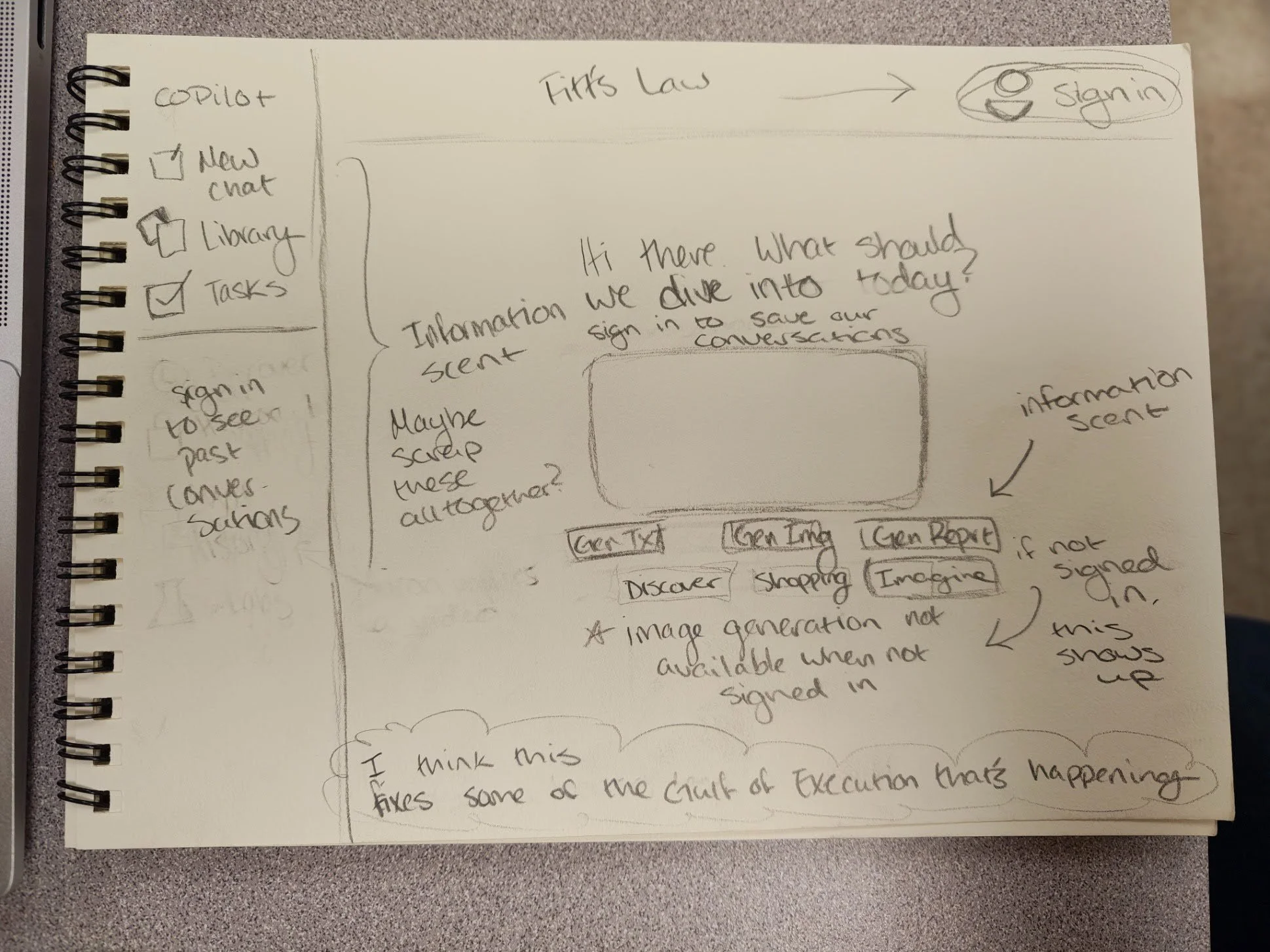
Fitts’ Law:
Sign In is moved to the top right of the screen and should be a prominent button. Anything that’s meant to be clicked (like the side bar) is also larger and more prominent
Information Scent:
Kept the prompt buttons under the text input box for chatting, but relocated the shopping, discover, explore, and imagine tabs to under this space as well. These categories seemed better as a way to prompt copilot, rather than explicit categories on the left side of the screen.
Gulf of Execution:
The website now informs users that their conversations will not be saved unless they are signed in. I imagined some sort of asterisk to draw attention to the fact that image generation isn’t available unless signed in, but maybe it would be better to not even show it to users until they’re signed in.
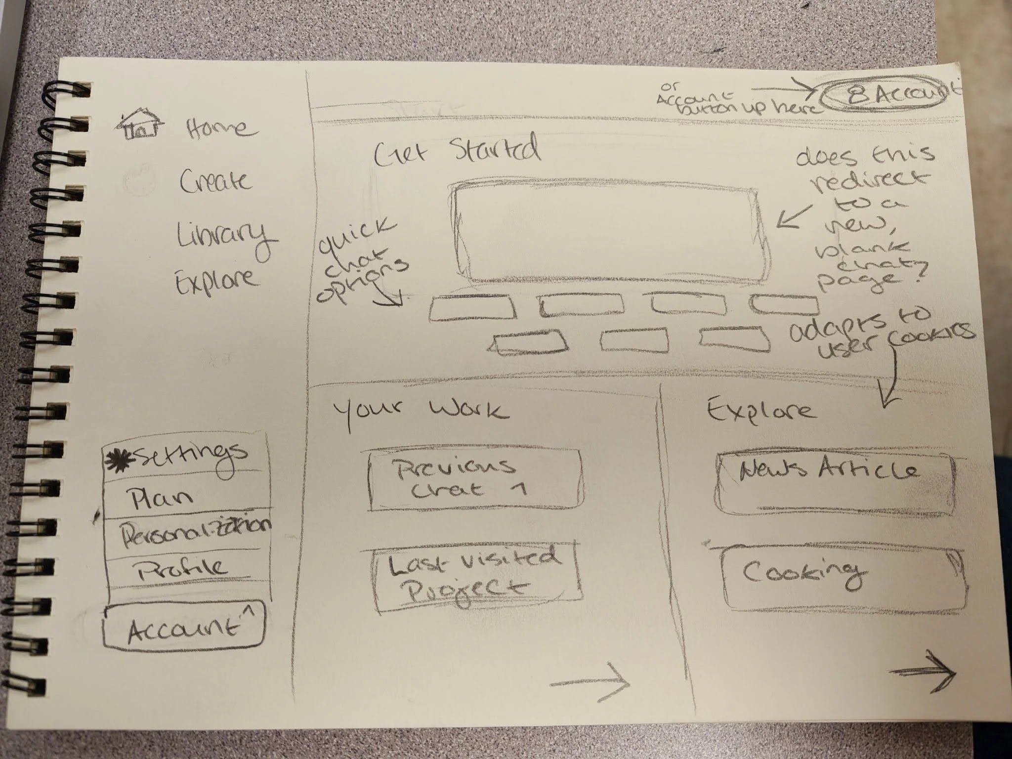
Fitts’ Law:
The sign in/profile button is larger in this example. The home, create, library, explore categories stayed where they are, but have been scaled up slightly to make them more prominent than they were originally.
Information Scent:
Created a more visual landing page with three sections. These sections should be information rich because they readily showcase what the user should expect to find in each one.
Gulf of Execution:
This overall fixes the gulf of execution because there’s much less ambiguity in where a user needs to go to find or execute tasks while using copilot.
Liz’s Sketches
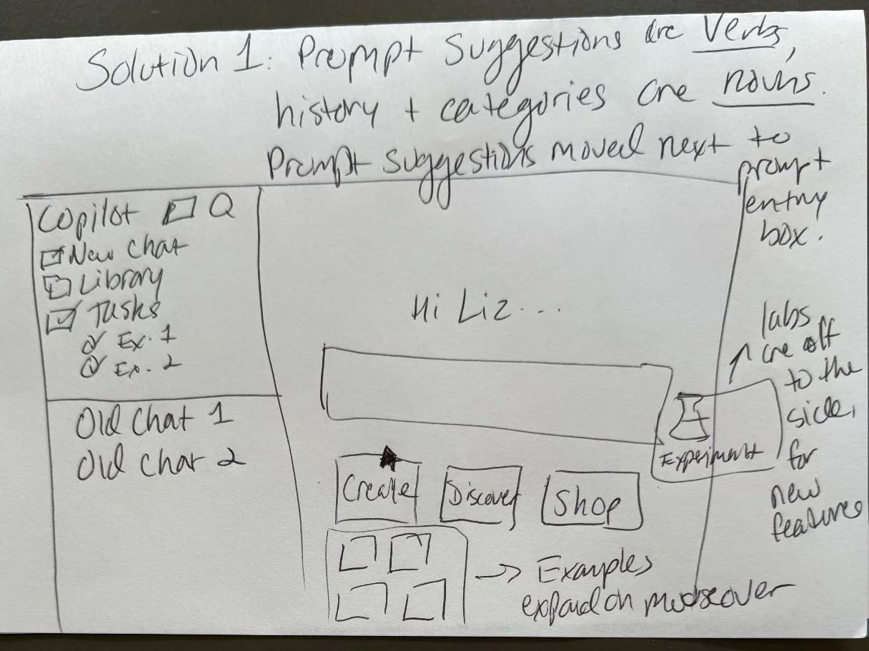
Information Scent:
In this redesign, the prompt suggestions are written as verbs (ways to use Copilot) and they are moved under the prompt entry box. The “Labs” button is moved off to the side for experimental tasks that may function unexpectedly or inconsistently.
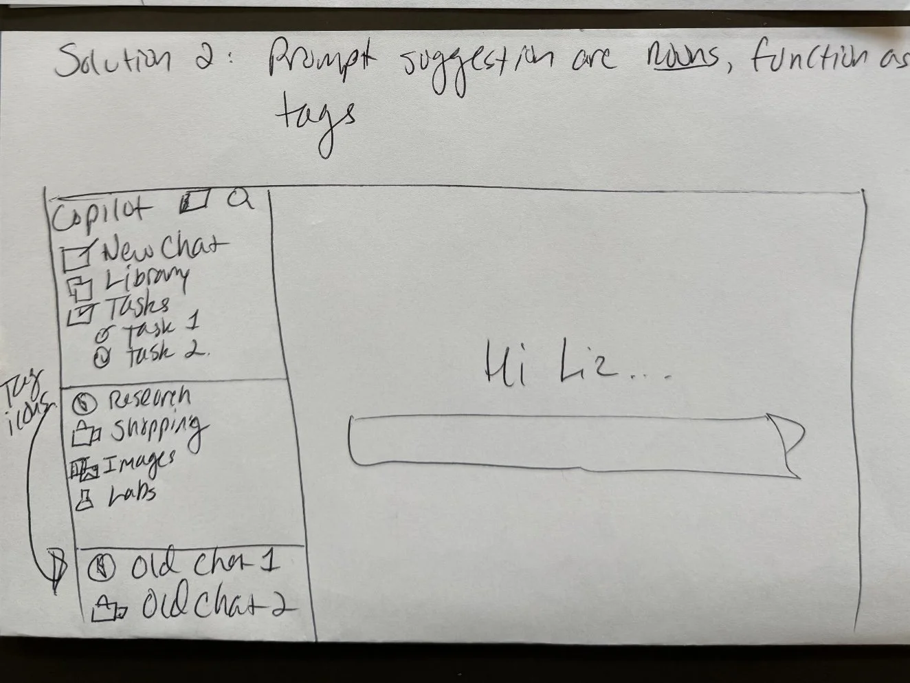
Information Scent:
The prompt frameworks function as tags on the chat history to help users identify what framework they used to create the results (whether they are satisfied with that result or want to try a different framework).
Gini’s Sketches
Consistency:
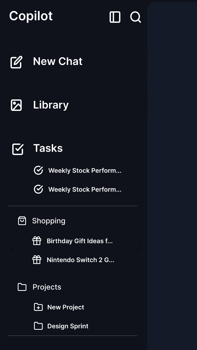
All shopping‑related conversations are moved under the Shopping section in the sidebar, just like how task‑related conversations are stored under Tasks. Only general chats created from New Chat stay in the main conversation list.
Gulf of Execution:
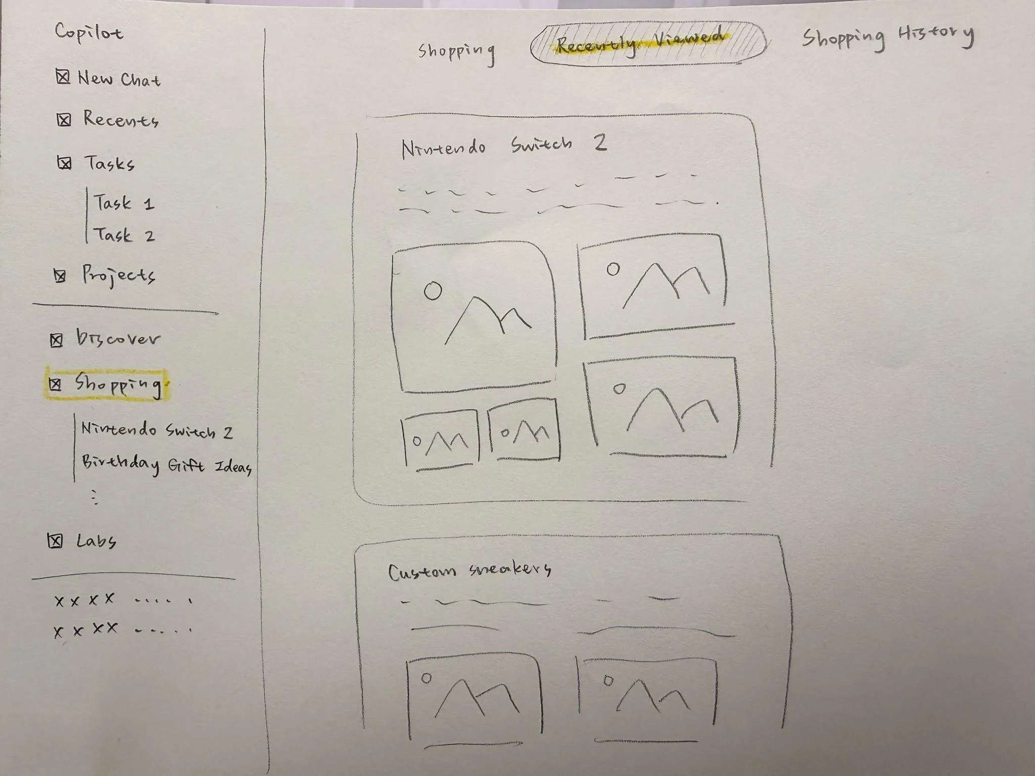
The Shopping page includes clear subpages— Recommended Products, Recently Viewed, and Purchase History—so users can find their shopping activity without searching through unrelated chats.
Visibility:
All shopping‑related content is now visible directly inside the Shopping page.
Information Scent:
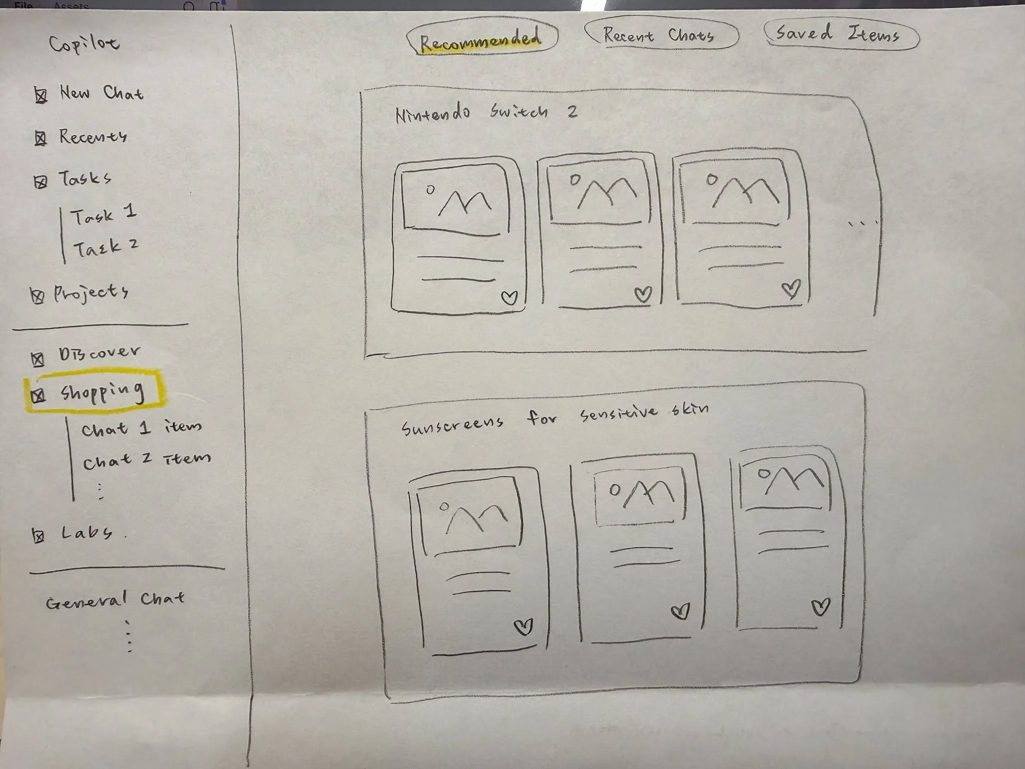
After group discussion, we redesigned the Shopping page to include three subpages: Recommended, Recent Chats, and Saved Items, since the original Copilot Shopping page does not provide any clear subpage structure. The new labels provide clearer Information Scent than an ambiguous option like “Recently Viewed,” helping users quickly identify where to go based on their intention without guesswork.
Decide
After comparing our sketches, we converged on redesigning the landing page and a sample shopping task. We chose this direction because it addressed multiple problems at once: unclear navigation, weak information scent, inconsistent sidebar behavior, and difficulty finding shopping-related history.
Landing Page
Egregious Fitts’ Law violations
Inconsistent placement of the account/sign in buttons
Weak information scent
Vague category names, confusing prompt/chat layout made it difficult for users to know where to look for what they wanted to accomplish
Shopping Page
Lacks consistency
Did not keep task-related conversations stored or nested under that task category
Gulf of execution
Users must sift through completely unrelated chats before finding ones related to their shopping history
Prototype - first version
We redesigned the landing page, sidebar, and shopping experience. The sidebar was redesigned to work more like a storage and history system, while the prompt categories were moved closer to the chat input to improve visibility and information scent. The shopping page was reorganized with clearer shopping-related sections and paths for users to return to previous product searches.
Landing page
In our first version of the landing page redesign, we moved the vague category names from the sidebar to the area below the chat input, treating them more like quick prompt options instead of primary navigation. We also redesigned the sidebar as a storage and history system, so task-related and shopping-related content could be grouped more clearly. The goal was to improve information scent, visibility, Fitts’ Law, and gulf of execution by making the main actions easier to understand and access.

Shopping Page
In the first version of the Shopping Page redesign, we reorganized Copilot’s shopping experience into four subpages: Recommended, Recently Viewed, Shopping History, and Our Chats. This structure was designed to help users quickly switch between product recommendations, past shopping activity, and related conversations without searching through unrelated chat history.
The sidebar also highlights the Shopping category when users are actively in that section, making their current location more visible. Product recommendations are grouped into larger categories, while the top navigation bar gives users a clearer path to move between shopping-related features. In the Our Chats subpage, past shopping conversations are shown as separate containers with topic titles and summaries, helping users revisit previous shopping searches more easily.


Class Feedback
After presenting the first version of our prototype, we received class feedback on both the sidebar and the Shopping Page. Students liked that Tasks, Shopping, and Projects were separated instead of being mixed into general chats, because this made it easier to return to previous activities.
However, the feedback also showed that some labels still needed improvement. For example, users questioned what exactly belonged in Library, whether Shopping History overlapped with Recently Viewed, and whether users should be able to create their own categories beyond Shopping and Projects.
This feedback helped us refine the second version by making labels clearer and improving the distinction between different shopping-related sections.
Sidebar
Strengths:
People liked that Tasks, Shopping, and Projects are separated instead of being lumped into general chats.
It’s easier to go back and see “what I was doing.”
Feedback 1: What exactly is in “library”?
Rename “library” to something clearer like “history”?
Consider changing the current library icon?
Feedback 2: Why “Tasks” looks bigger than “Shopping” and “Projects”?
Maybe group the smaller items under a heading like “chat categories,” or “history/refinements” for clarity
Feedback 3: Can users define their own categories beyond just “Shopping” and “Projects”?
Consider more categories (e.g., health, appointments) as users need them
Library/history could be the place where user-generated categories/tags are nested
Shopping Page
Feedback 4: Is “Shopping History” purchase history? Could it overlap with “Recently Viewed”?
Make the distinction clearer in the UI/labels

Test
We tested whether users could locate a saved product or purchase link more efficiently. The task asked users to imagine that they had searched for a Nintendo Switch 2 in Copilot and now wanted to find where to buy it. The success metric was the time required to locate the “Saved Products” or “Saved Items” page.
Methods
We used convenience sampling for user testing. Each participant tested both the original Copilot and our redesigned prototype. The testing combined aspects of A/B testing, by comparing the original and redesigned layouts, and usability testing, by observing how users navigated the shopping flow.
Our metric for success was the time it took users to locate the Saved Products or Saved Items page. Each test was timed with a stopwatch, and testers took notes on participants’ thoughts, choices, and questions during the task.
User testing

Task
You’ve used Copilot to search for a Nintendo Switch 2, or a previous saved search in the original Copilot, and now you want to buy it. Show me where you would go in Copilot to find a purchase link.
Testing Reflection
Testing with five users gave us useful feedback within the short sprint timeframe, but a larger sample size would be helpful if the project were developed further. The five participants still provided varied perspectives and helped us identify where the prototype worked well and where interaction details needed refinement.
One important insight was that all users wanted to use the prompt entry box. However, even without full prompt-box functionality, users were still able to navigate to the Shopping Page and Saved Items page. This suggested that the main user flow in our prototype was intuitive and understandable.
Based on this feedback, we added an interactive prompt-box function to the final prototype. This simulated users typing and submitting their own prompt in Copilot, making the prototype feel closer to the real Copilot experience while still supporting our redesigned shopping flow.
Prototype - final version
Based on class feedback and testing, we refined the prototype to make the shopping flow clearer and more interactive. The final version kept the redesigned landing page, sidebar, and Shopping Page structure, but improved the experience by making the prompt box behave more like the live Copilot interaction.
Because all users tried to use the prompt entry box during testing, we added an interactive prompt-box function. When users click the input, the prototype simulates typing a sample shopping prompt and then leads them to a sample response page. This made the prototype feel closer to the real Copilot experience while still showing our main redesign goal: helping users shop, save products, and return to previous shopping tasks more efficiently.
Reflection
This sprint helped me understand how fast design decisions can be made when the team follows a structured process. In my individual case studies, I usually control the whole direction myself, but in this project, I had to explain my design reasoning, compare ideas with teammates, and merge different sketches into one shared prototype.
My biggest takeaway was that information scent is especially important in AI products. When a tool has many possible capabilities, users need clear labels and visible paths to understand what they can do next. A powerful AI system can still feel confusing if users cannot predict where to go, where results are saved, or what each section means.