Case Study
Zara Website UX Redesign:
Interaction Design Principles
Context &
problem statement
In this project, I analyzed the user experience of the Zara website based on key interaction design principles, including visibility, feedback, constraints, and consistency.
While Zara has a clean and minimal visual design, I found several interaction issues that made the user experience less intuitive and sometimes confusing.
For example, users may not clearly understand system responses, available actions, or product availability without extra effort. These issues can lead to unnecessary clicks, uncertainty, and frustration during browsing.
The goal of this project was to identify these usability problems and redesign the interface to make interactions clearer, more predictable, and more user-friendly.
Design Process
I used a heuristic evaluation approach based on interaction design principles introduced in class.
First, I explored the Zara website and identified usability issues through my own interaction experience. Then, I categorized each issue based on a specific design principle:
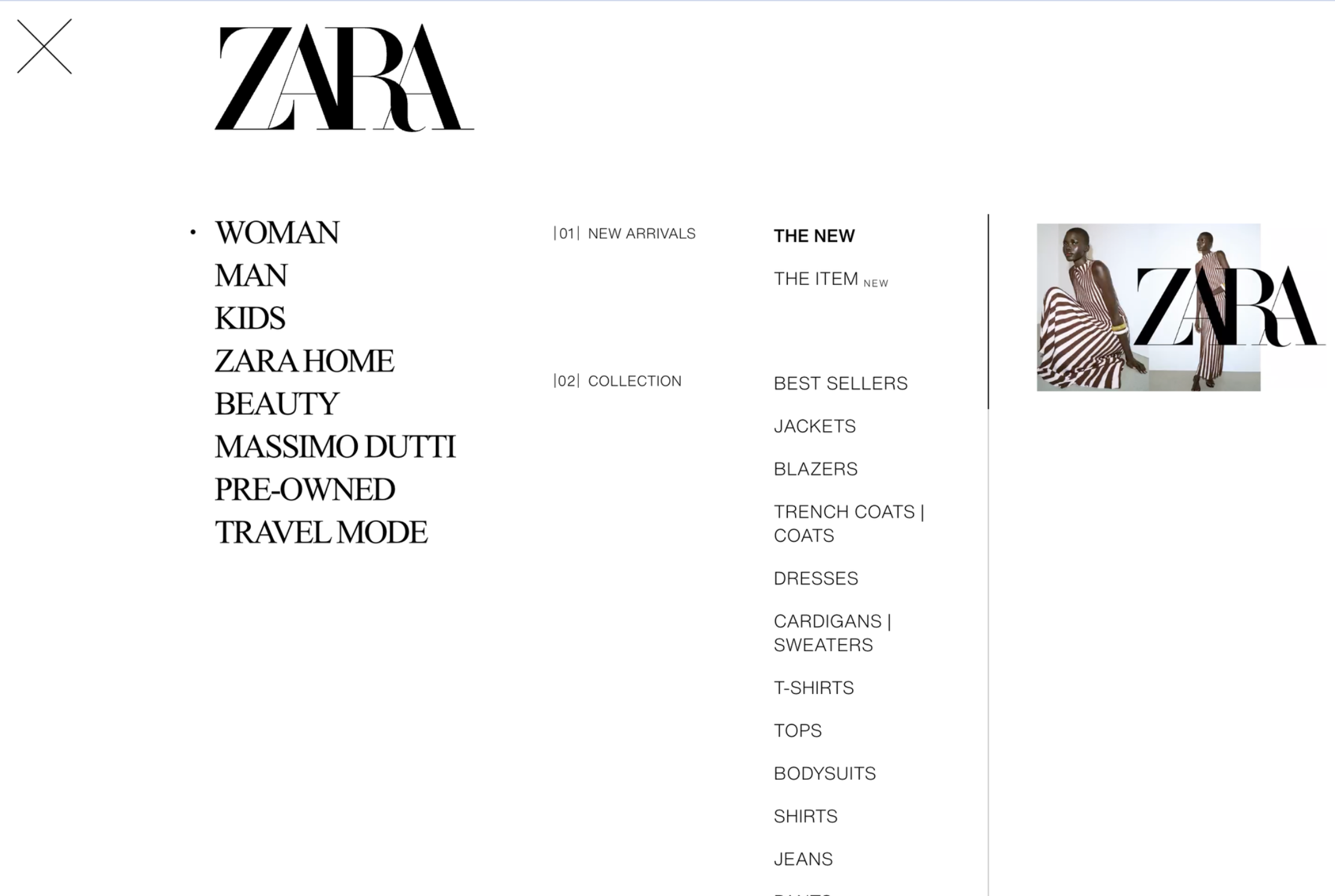
Visibility: The menu lacked clear feedback when hovering, making it hard to understand available options.
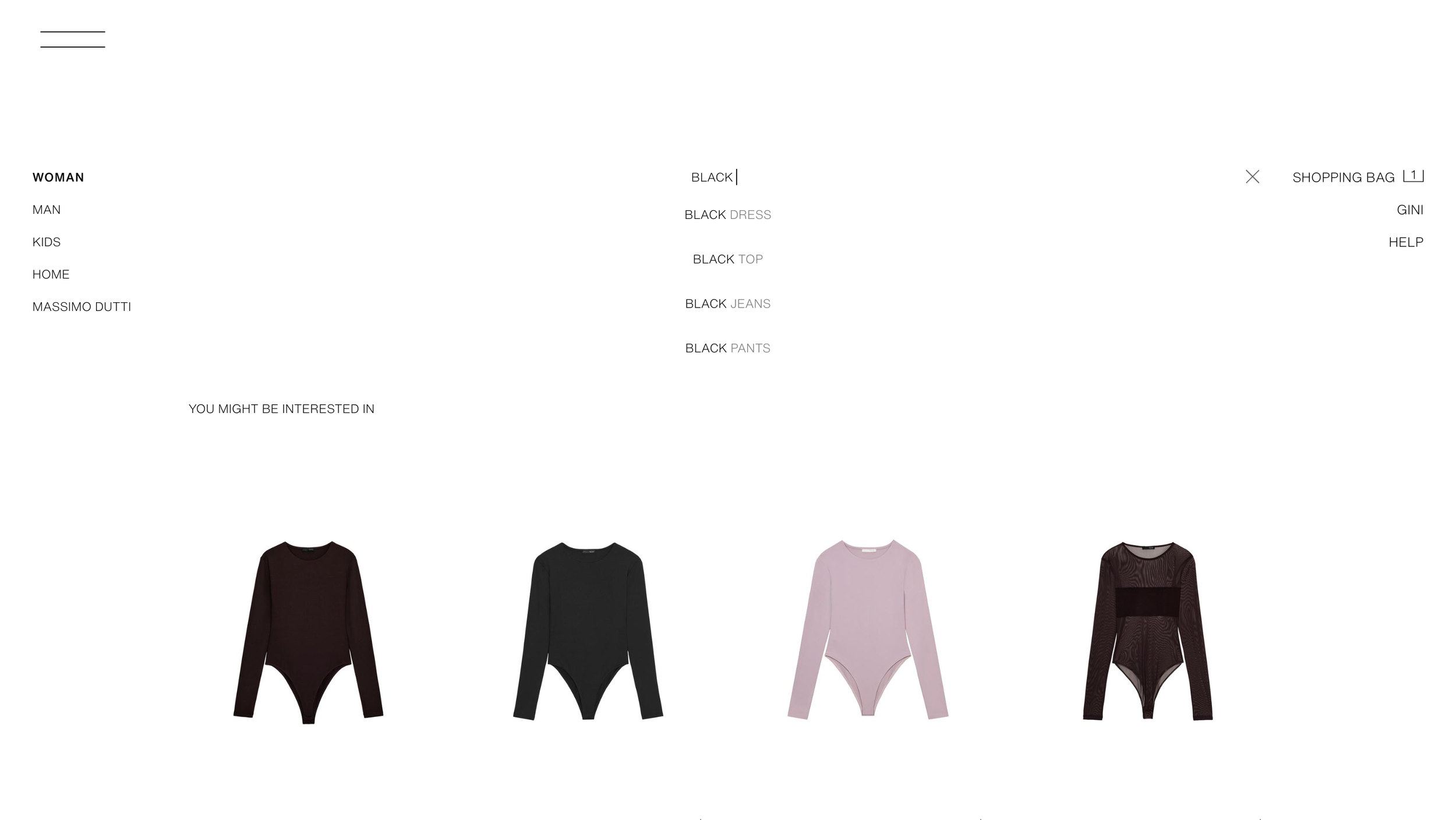
Feedback: Search suggestions did not clearly show which item was selected when using the keyboard.
Constraints: Some unavailable products looked identical to purchasable items, causing confusion.
Consistency: Different layout controls were used across desktop and mobile, increasing learning effort.
After identifying the problems, I created redesign solutions for each issue. My focus was not to redesign the entire website, but to improve specific interaction points with small but meaningful changes.
I used simple visual changes such as highlights, previews, labels, and consistent icons to improve usability without breaking the original design style.
Outcome
The redesigned solutions improved the overall usability in several ways:
Users can better understand available actions through clearer visual cues (visibility).
System responses become more predictable with immediate and consistent feedback.
Users can avoid unnecessary actions by seeing constraints earlier in the interaction flow.
A consistent design language reduces confusion and makes the interface easier to learn.
Overall, these improvements help users complete tasks more efficiently and reduce cognitive effort during interaction.
Visibility / Discoverability
Visibility means making information easy to see so users can understand what actions are available without extra effort.
Problems in Original Design
When hovering over categories, the menu does not provide any response that helps me quickly find my target.
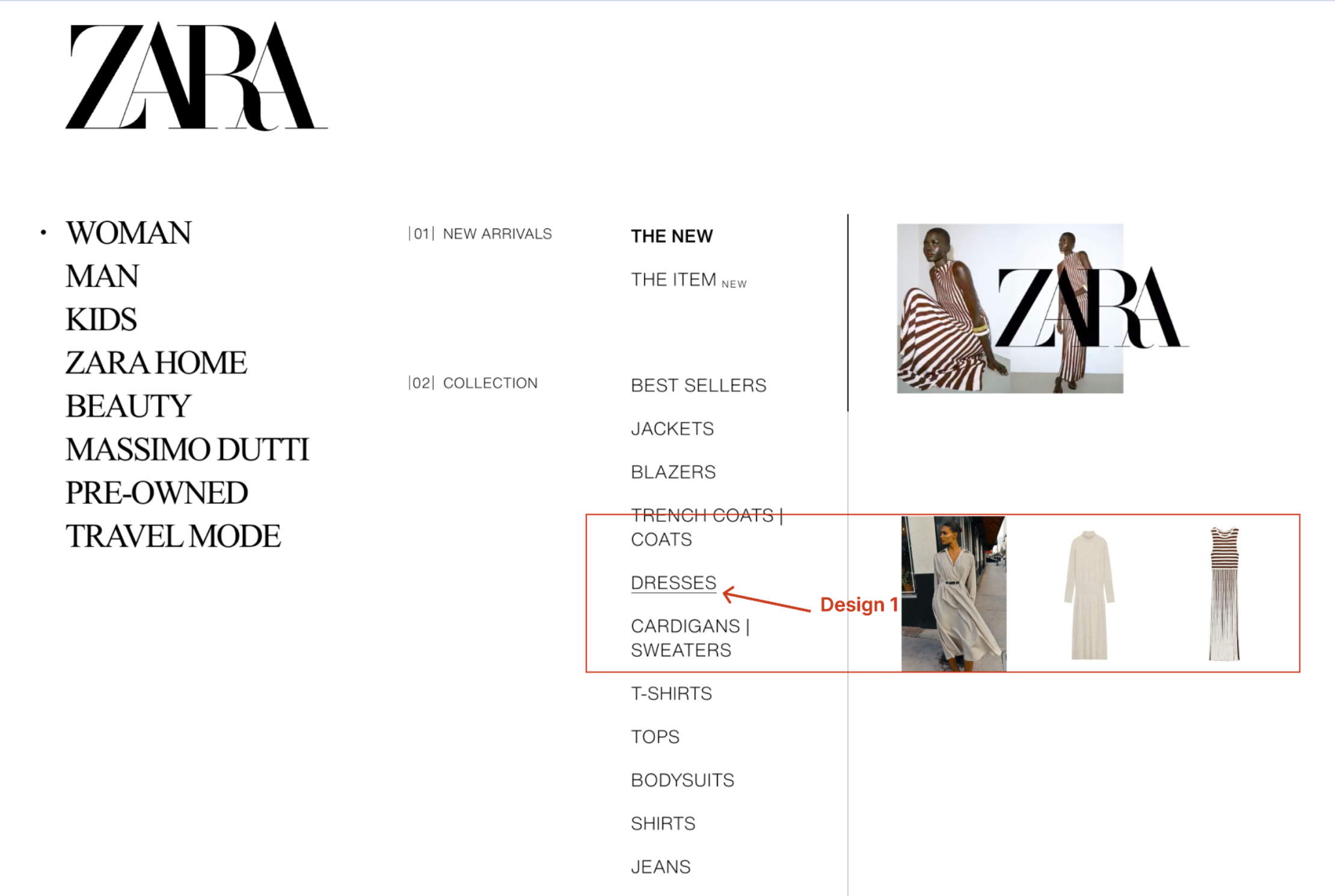
My Design Improvements
In the redesign, hovering over a category shows a visual underline to indicate the current focus. At the same time, preview images related to the hovered item appear on the right side, giving users a quick idea of what they will see before clicking.
Why it’s better
This improves visibility by providing immediate visual feedback and content previews. Users no longer have to guess what each category contains, making it easier to quickly find their target without extra clicks.
According to Norman, good visibility reduces the need for users to guess how an interface works by making possible actions perceptible (Norman, D., The design of everyday things).
Feedback
Feedback means that the system clearly and immediately shows users the result of their actions.
Problems in Original Design
When using the search bar, suggested keywords appear as the user types. Although users can navigate these suggestions using the keyboard and press Enter, there is no clear visual feedback indicating which suggestion is selected. When Enter is pressed, the selected suggestion briefly flashes in the search bar, but the search results still reflect the originally typed query instead of the selected suggestion.
My Design Improvements
The redesign highlights the selected search suggestion during keyboard navigation and ensures that pressing Enter applies the selected suggestion as the search query.
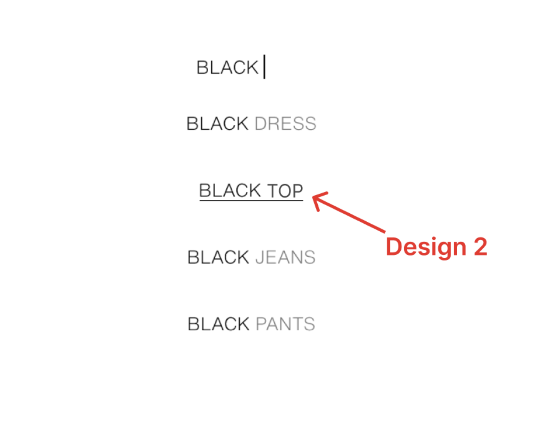
Why it’s better
This improves visibility by providing immediate visual feedback and content previews. Users no longer have to guess what each category contains, making it easier to quickly find their target without extra clicks.
According to Norman, good visibility reduces the need for users to guess how an interface works by making possible actions perceptible (Norman, D., The design of everyday things).
Constraints
Constraints are design limits that control what users can and cannot do, helping them avoid invalid actions.
Problems in Original Design
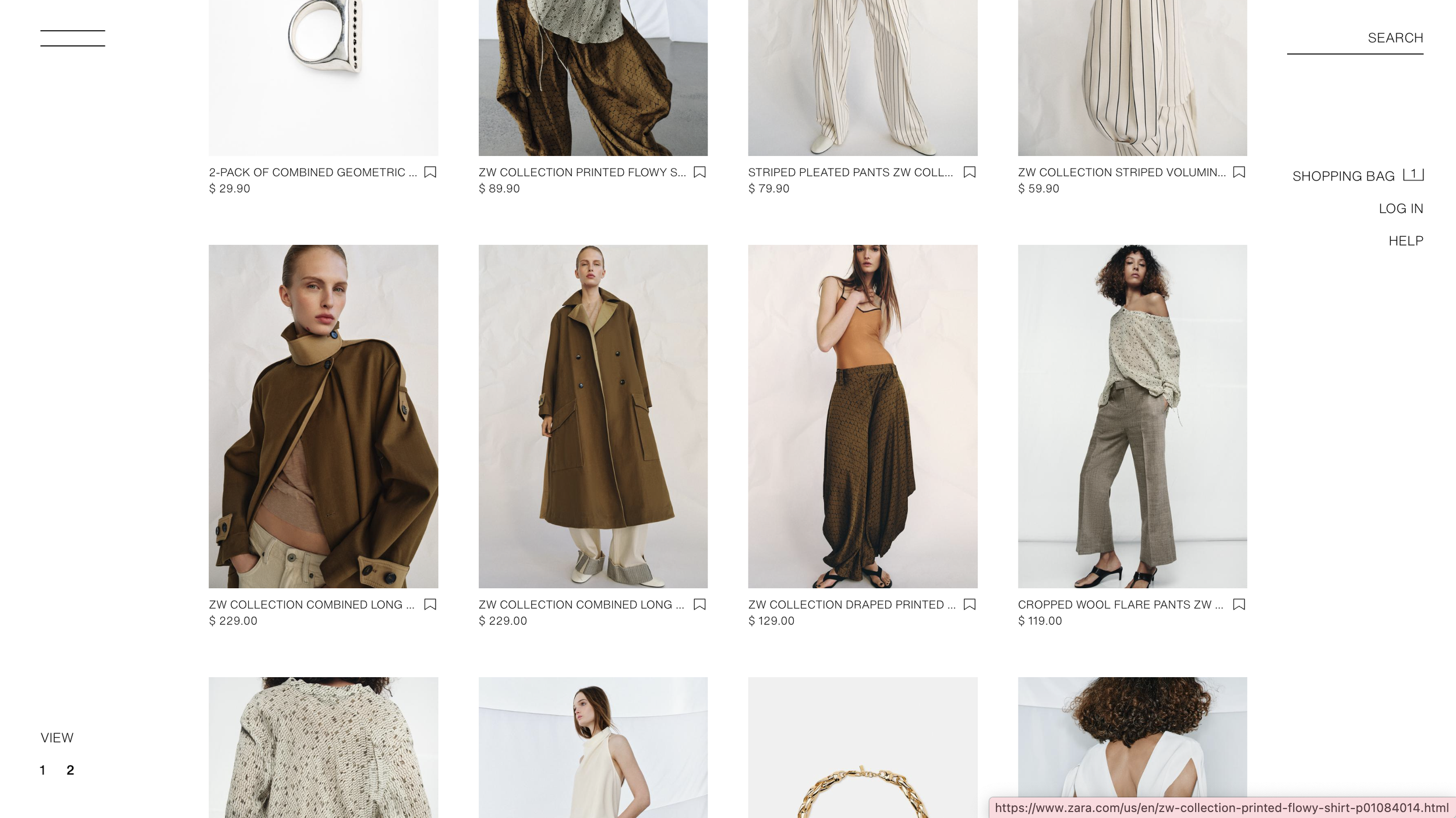
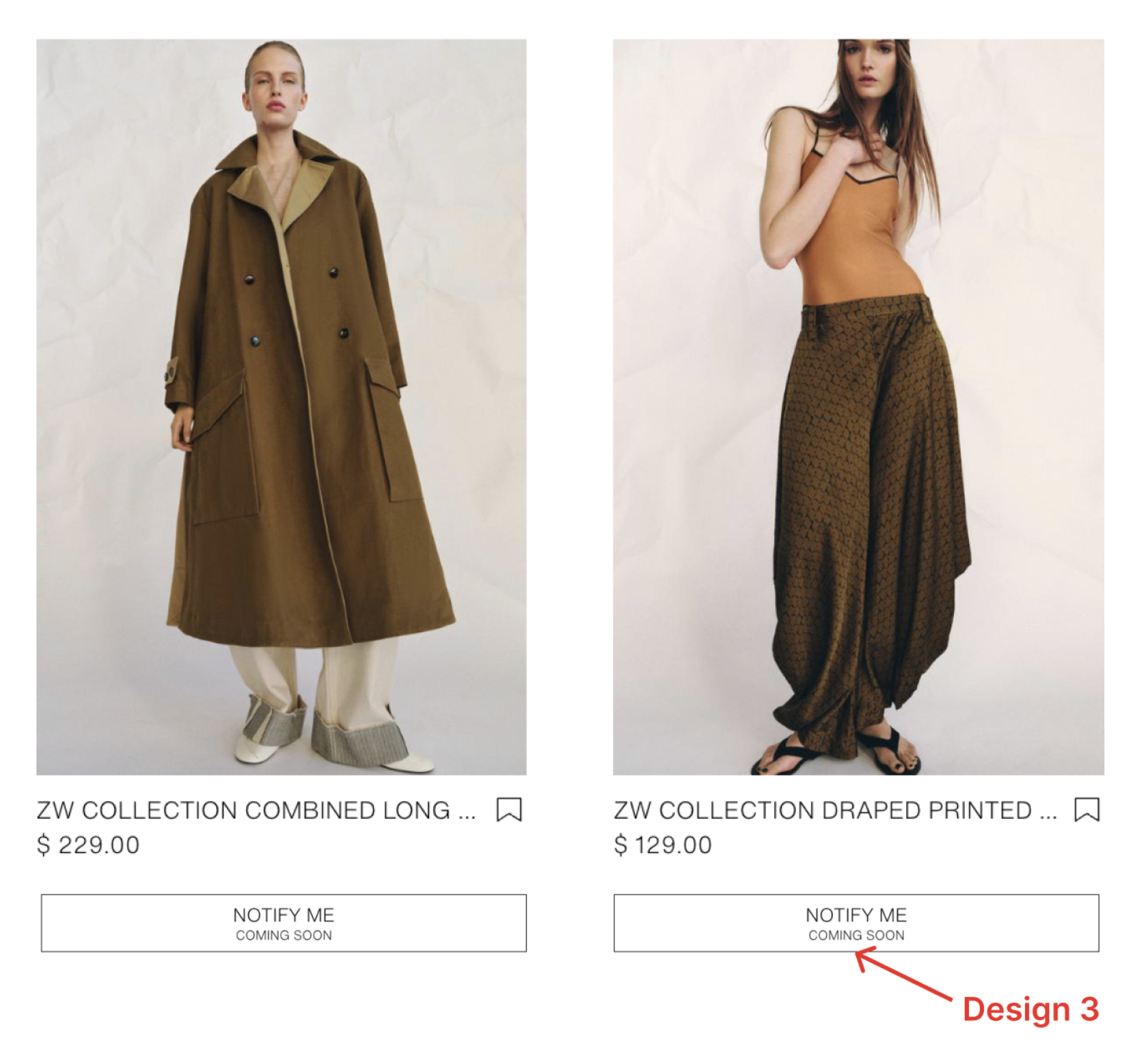
On the “New Arrivals” page, some products appear identical to purchasable items even though they are not yet available. Users only discover the “Coming Soon” restriction after clicking into the product page, which can feel unexpected and waste time.
My Design Improvements
Instead of only showing “Coming Soon / Notify Me” on the product page, the redesign moves this information one step earlier to the product list page. This way, users can see that the item is not available before clicking into it.
Why it’s better
By showing the same limitation earlier, users do not have to click into a product just to find out they cannot buy it. This makes the browsing experience clearer and avoids unnecessary clicks and frustration by revealing constraints earlier in the interaction flow (Norman, D., The design of everyday things).
Consistency
Consistency means using the same patterns across the interface so users do not have to relearn how things work.
Problems in Original Design
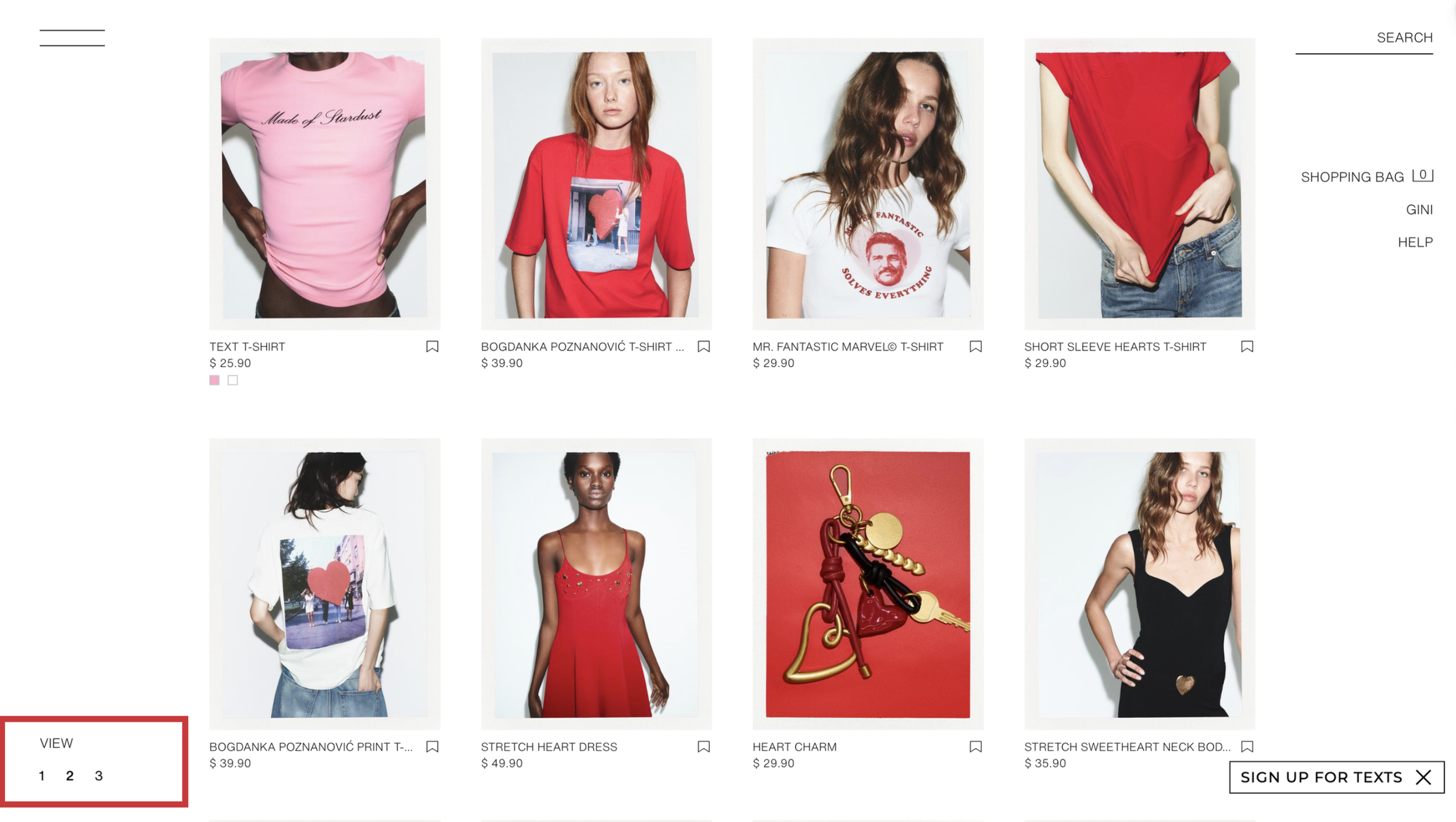
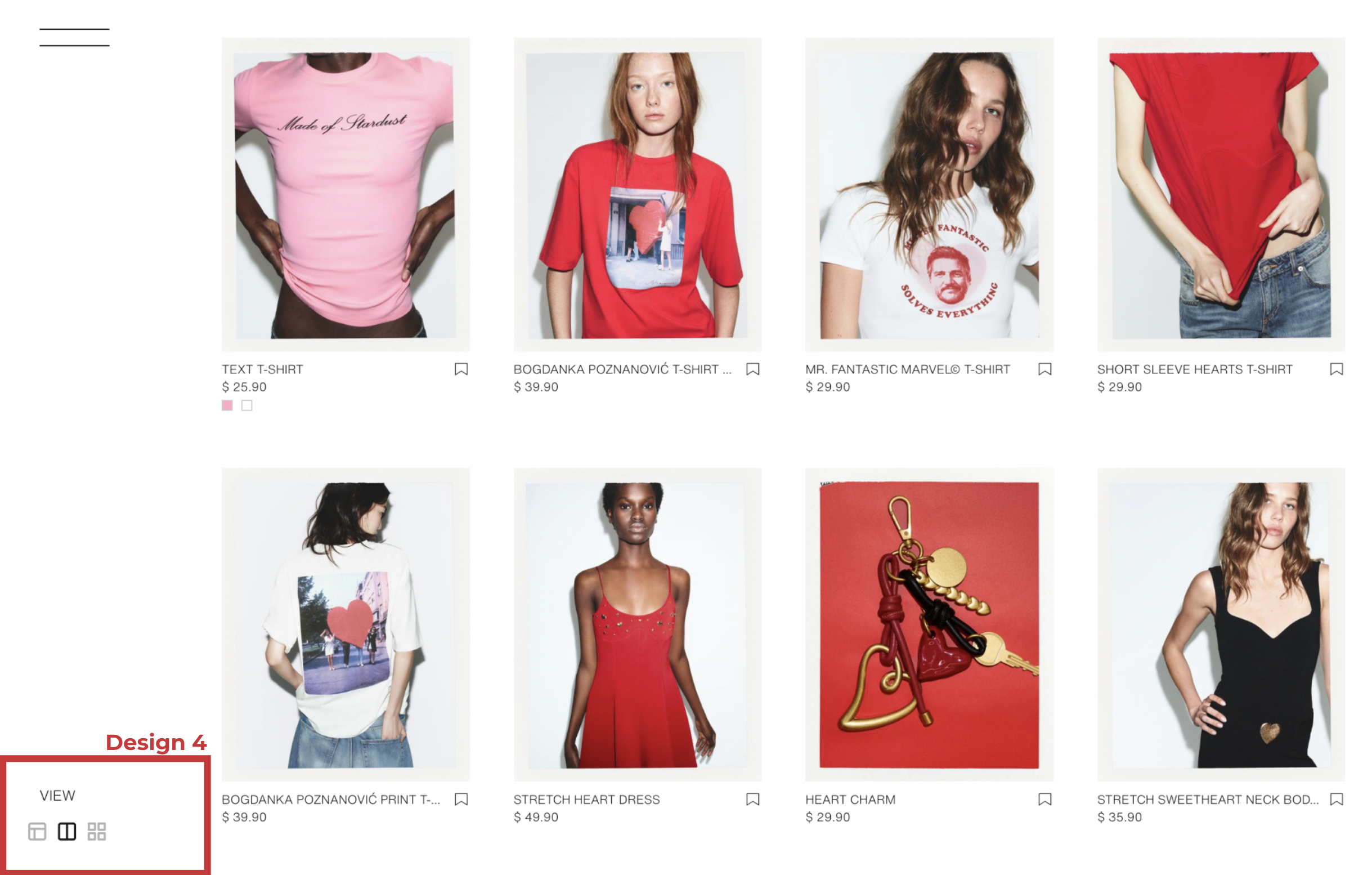
On the desktop version of Zara’s website, the layout options are represented as “View 1 2 3,” which does not clearly indicate how the product layout will change. In contrast, the mobile version uses layout icons (such as grid view) that visually show the arrangement. This inconsistency across platforms makes the interaction harder to understand.
My Design Improvements
The desktop version is redesigned to use the same layout icons as the mobile version (e.g., grid and list view icons) instead of numeric labels. This creates a consistent way to switch layouts across devices.
Why it’s better
Using the same icons across platforms reduces confusion and learning effort. Users can immediately recognize what each layout option does without trial and error, making the experience more intuitive.
“When things always behave the same, users don't have to worry about what will happen. Instead, they know what will happen based on earlier experience. -- Jakob Neilsen”.
Reflection / Lessons Learned
Through this project, I realized that even small interaction details can significantly impact the user experience.
Before this assignment, I often focused more on visual design. However, this project helped me understand that usability is not just about how things look, but how clearly the system communicates with users.
I also learned how important it is to apply design principles such as visibility, feedback, and consistency in a practical way. These principles helped me analyze problems more systematically instead of relying only on intuition.
In the future, I want to continue improving my ability to connect design theory with real interface design, and create products that are not only visually appealing but also easy and intuitive to use.